

Brand Consistency Made Simple: Aligning Print Design and Digital Marketing Colours
Have you ever noticed you noticed your brand’s colours on screen can look different to when you print them? We have spoken about the importance of branding before, if you missed it you can read our 4 Reasons Branding is Crucial for Building Trust and Loyalty here. To highlight, your brand is the overall emotional connection your company has with its customers, playing a vital role in establishing trust, credibility, and loyalty.
When it comes to branding, consistency is key, whether it's in how your brand looks, the messaging, or how you connect with your audience on social media. One crucial element is of course your brand colours. In this noon journal, we’ll talk about why colours can look different across platforms and how to ensure consistency between print and digital design.
Why Do Colours Look Different across Print and Digital Design?
There are different types of colours; RGB, CMYK, HEX and PMS. So what which one do you use and why do these colours look different on your computer screen compared to a marketing brochure?

RGB: It stands for Red Green Blue and it is the colour model you use across your digital screens (mobile, desktop, iPad etc.) These colours are created by mixing light, which allows RGB to be vibrant, bright and even neon if that’s what you like! Unfortunately, you cannot print in RGB since paper doesn’t produce any light as it absorbs and reflects light that is procured by another source such as the sun or your lamp…which is why we need a different system for printing.
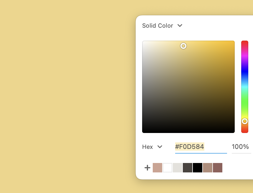
HEX: This one you’ll probably have seen before. HEX codes are commonly used in web development and are often found in CSS. HEX is a character-based numerical representation of RGB values. Essentially, there’s no difference between RGB and HEX colours. They’re just different ways of communicating the same values (red, green, and blue).

CMYK: CMYK colours are made of four base colours: Cyan, Magenta, Yellow and Key (Black). This is the colour model the printers use! These colours are created by blending inks, creating a full spectrum of colours. However it does lead to more muted or different shades compared to digital displays. Most of your marketing material for your business such as business cards, posters, flyers and brochures are printed used CMYK colours. However, for certain print job like banners, promotional products, or textiles another colour system, Pantone Matching System (PMS), may be used for precise colour matching.
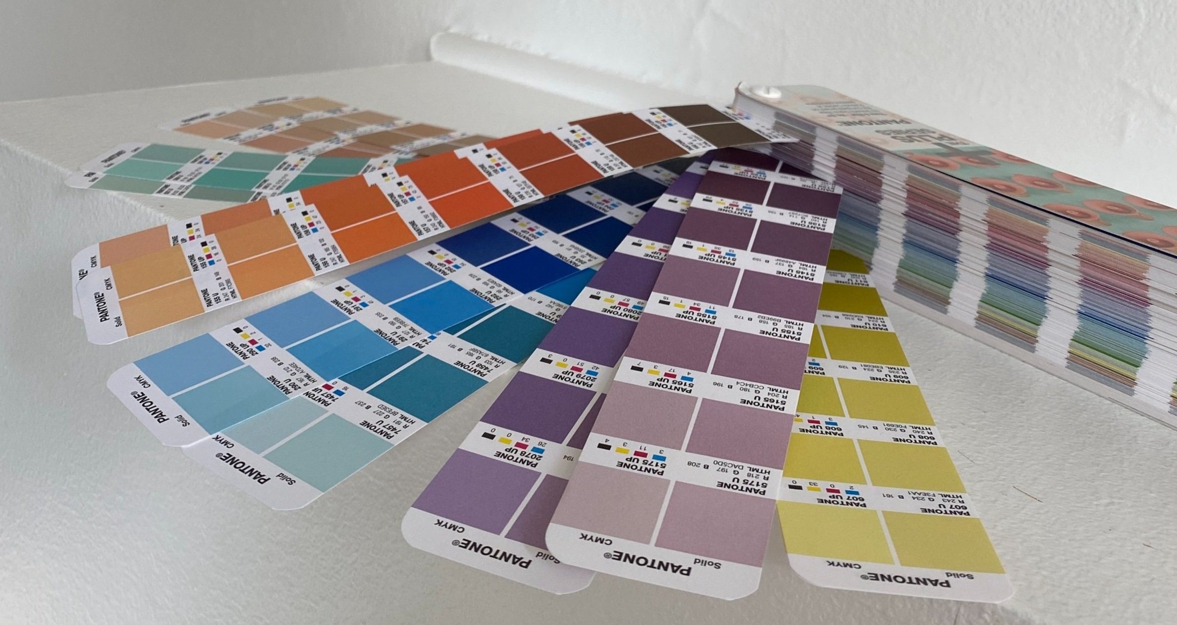
PMS: The Pantone Matching System is a universal colour language that was developed by Pantone Inc. PMS assigns unique numbers to specific colours, making it easy for designers and printers to achieve the exact same shade every time, regardless of the equipment or materials being used. Pantone actually has a tool you can use to find your Pantone colour across both print and digital media.
Without adjusting for these differences, your brand colours may not be accurately represented across platforms, which can hurt brand consistency.
How to Maintain Colour Consistency Across Platforms:
Consistency is essential in branding, so how do you keep your brand colours looking the same in both print and digital formats?
Start with the Right Colour Model:
When designing for digital platforms, always make sure you are creating your designs in the RGB or HEX colour model. This ensures your colours always look vibrant and accurate across yours screens.
For print design projects, use the CMYK colour model to get an accurate representation of how your colours will look once printed. This helps avoid any surprises when your designs go to print.
Make sure you are using the correct colour codes in your brand style guide! This ensures your colours are always accurate no matter where they appear on websites, social media, or printed marketing materials. This helps maintain consistency across websites, social media, and printed marketing materials.
Work with a designer. If you’re unsure about the right colour models or how to convert between RGB and CMYK, don’t hesitate to reach out to your graphic designer. They can ensure your brand’s colours are aligned across both print and digital platforms, helping you avoid those costly mistakes and ensure consistency.
Ensuring consistency in your brand colours across both print and digital platforms is essential for building a cohesive brand identity. By understanding the differences between colour models like RGB, CMYK, HEX, and PMS, you can keep your branding consistent and ensure that your customers recognise your business, whether they’re scrolling online or flipping through a printed brochure.
Need help aligning your brand’s colours across platforms? At Sunday Noon, we specialise in maintaining brand consistency across digital and print. Let’s work together to make sure your colours are always perfectly aligned.